The Caboolture Sports Football Club was founded in 1969 and over its fifty year history has steadily built up its membership numbers. In 2019 the senior mens team gained entry into the Brisbane Premier League competition and at the same time moved into a brand new world class facility. The club’s profile had been raised, but its identity and branding had not kept pace with the changes! The professional sports club required rebranding
An emboldened snake
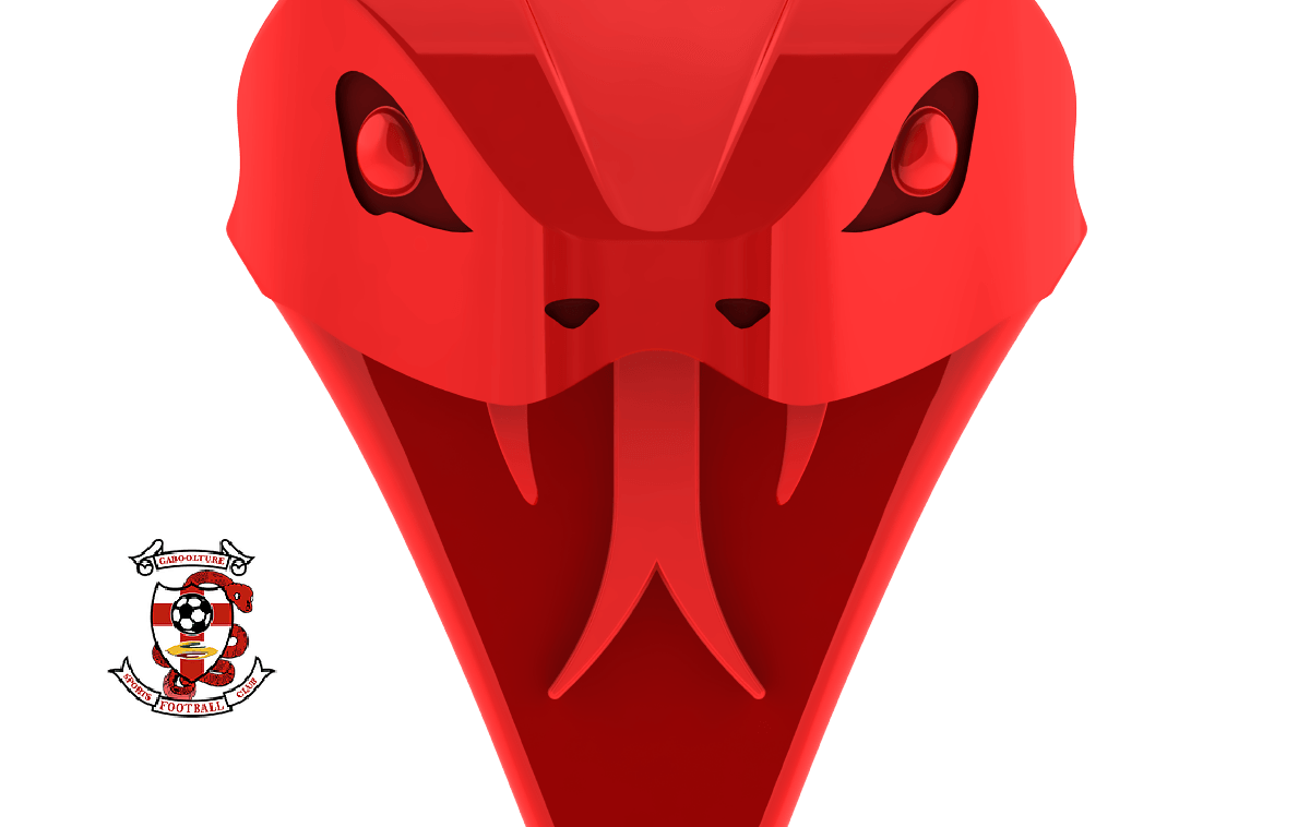
The club had originally adopted a badge for
its identity incorporating a shield and a snake (the name Caboolture is derived from a local Aboriginal phrase meaning ‘place of the snake’).
The snake
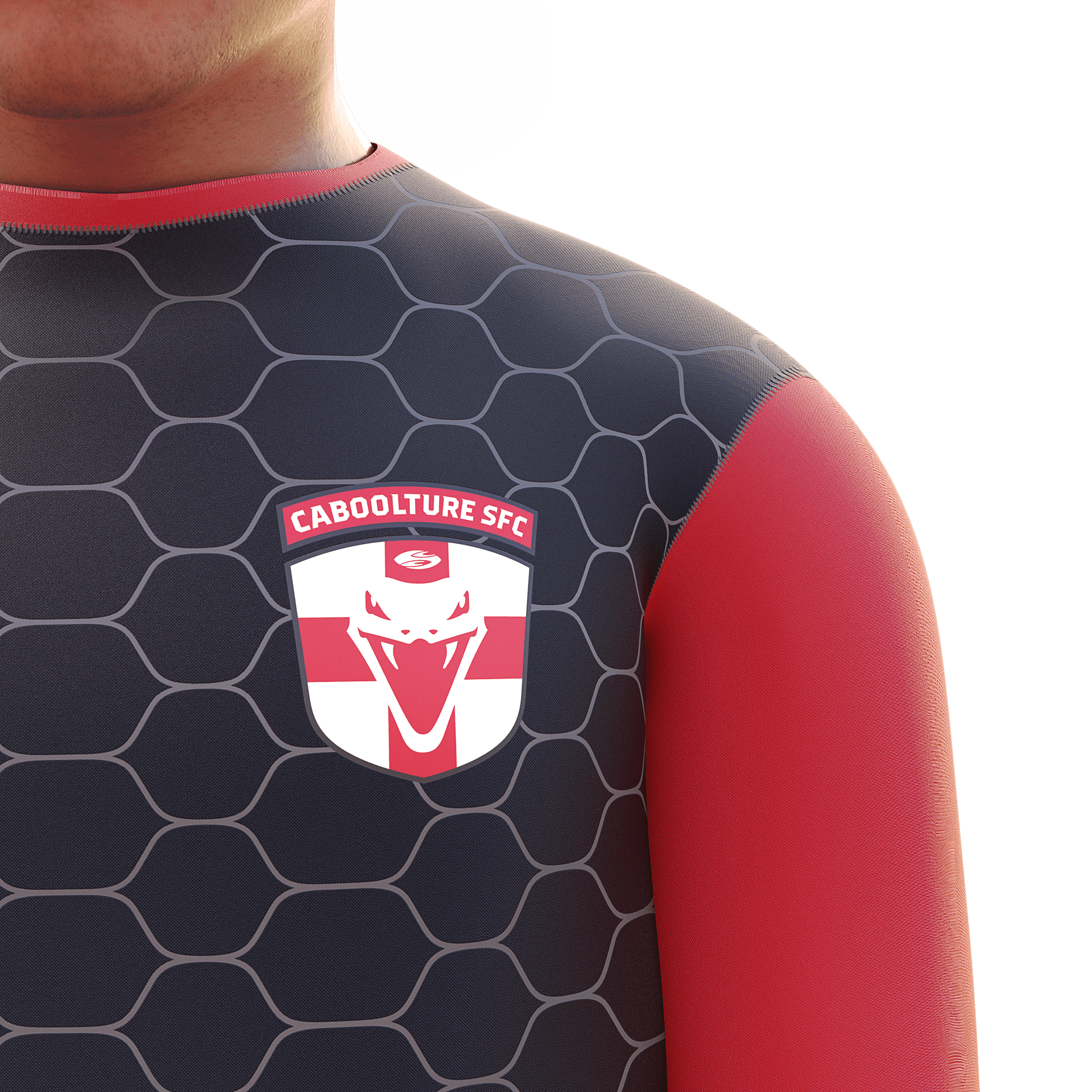
in the old badge was looking distinctly worm-like and a tad limp. We made the shield simpler
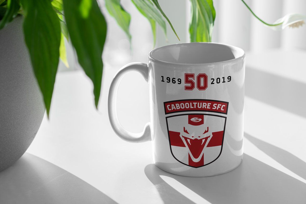
and incorporated a slightly more proactive snake’s head. The club is commonly known as ‘Caboolture SFC’ and we recommended they adopt this
for their logo – it’s shorter, stronger and more
soccer-like! Our work lead to a stronger more powerful brand identity.
Our old logo had been in place for over fifty years, so gaining endorsement from over 2,000 players and members for a new one was not going to be straight forward! Willmore Design took us through a smooth process and I think we’ve achieved a 99% approval for the new identity and rebranding. We now have a dynamic logo which matches the club’s new grounds and facilities.
Mark Barnett
Vice President, Caboolture Sports Football Club


